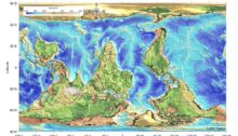

The drawing of maps to promote a political view or a social view is not new. And it is also not the topic of interest here. I include the upside down map above as it shows a different, and quite unusual feature. Look at Greenland. There is something odd about it. Besides the projection, it looks misshapen, somehow, and it looks like a very odd mountain. It should be the tallest mountain on Earth if this picture is correct.

A subtly different effect happens on this map. It’s, in fact, of the Swiss alps. It is tempting to think that the white snow is on top — it is not, it is in valleys. Both this map, and the upside down world map, display height in an unusual way; not because of shadows and lighting, but because of where the lighting shines from.
Cartographic convention has, for more than a century, been to draw lighting on a map from the northwest. From a realism point of view, this is absurd: the sun will never shine from that direction, and thus the shadows on the map will be off. The shady north side of a slope — the side most likely to retain snow and moisture — will be sunny on the map. Seen through that light, the southern-lit map above from Becker is much more realistic. But it doesn’t feel that way.
While the cartographers of the 19th century only had trial and error to guide their way, in modern day we have had, well, a lot more time for trial and error. Perhaps the most famous artefact of this, perhaps inadvertent trial and error, is the crater optical illusion, often seen in pictures of outer space bodies; moons, planets, etc.

The image above is fascinating in large parts because it is almost the opposite of the usual topography lighting we are used to from maps. Instead of a northwestern light source, we have an eastern one (similar, but not quite the same angle as the upside-down earth map). However, unlike an image of zoomed-out Earth, the foreign landscape gives us no visual cues on what is a valley and what is a mountain; there are no rivers or vegetation. The black and white photo also eschews the usual colour differentiation for high and low lands. So while the shading forms a similar effect to Becker’s map, the latter has an unassailable benefit of having rivers drawn in. With those, we can calibrate our map expectation, and see mountains and valleys for what they are.
Fundamentally though, after much trial and error, convention of map making has settled on a simple and easy to follow rule: the light will shine from the northwest. This gives us the familiar map of mountains and valleys we all know, and leads to the following awesome effect. Below, I have rotated the Spitteler and Holberg image. One of them has the light from “above” and the other is lit from “below”. The images are otherwise identical.
 Notice that the left image by default looks like craters, while the right image looks by default like mountains. At least for me, it takes conscious effort to see the opposite patterns now that the lighting appears to be coming from the north. The reason here is, simply, psychology. It’s the thing that can make a single shade of gray look like two completely and undoubtedly different shades of gray: the Cornsweet Illusion.
And that, in a nutshell, is why we use lighting from the north: it is psychologically easier to recognise light from “above”, even though it would never shine that way. Interestingly enough, despite my searching for a southern hemisphere map that would show South from above, I only found either transposed maps (i.e. lit from the northwest, so bottom right of the map) or the user-made map I showed above with the sun from the southwest, i.e. top right of the map.
Now that we’ve cleared the table on map lighting and its peculiarities, let’s discuss Shadowlands. The series of topography-data-turned-art shows a striking, black and white view of Europe. It is familiar, but ever so slightly off — and I’m not just talking about the black and white. Indeed, the shadows are deep, and the effect is striking, but there is one more subtle aspect contributing to the unique effect…

By its placement in this entry, we should be facing a foregone conclusion: the lighting angle is off. Ever so slightly, instead of coming from north-northwest, it’s coming from west-northwest; the direction of the sunset. Coupled with the dramatic shading that puts emphasis on the changed angle, and we get this impressive, almost-foreign landscape.
There are, of course, entire books written on the subject. But for our word-of-the-day-like purposes, maps are lit from the north/northwest. They’re done so because we expect the light to come from “above”, and even though we logically understand a map to be a top-down view, we still think of “up” on the map as “pointing to the sun”. And anything that points to the sun has to be brighter on the top side than on the bottom side.